
7 dark patterns in budgeting apps we documented
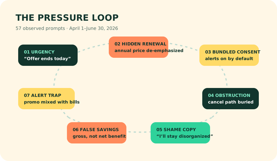
We documented 57 manipulative prompts across 11 budgeting and money apps from April 1 through June 30, 2026. Hidden renewal terms appeared most often; bundled notification consent came second. The worst patterns did not steal money directly. They distorted timing, price, or choice until an expensive decision felt like the natural next tap.
This field diary names patterns, not a blacklist. A product can use one poor prompt and still provide value; a tasteful interface can repeat manipulation. We recorded a pattern only when two editors could reproduce it on a publicly available US flow. Counts represent observed prompts, not every screen or every user. Product experiments may change after publication.
Persuasion becomes a dark pattern when material information is hidden, urgency is manufactured, a reasonable alternative is obstructed, or emotion substitutes for consent. That definition kept ordinary education and chosen reminders out of the log. The same evidence standard informs our screen-by-screen testing method.
| Pattern | Observed prompts | Typical consequence | Reader check |
|---|---|---|---|
| Hidden renewal | 13 | Trial price mistaken for ongoing price | Find standard annual total |
| Bundled consent | 11 | Marketing alerts enabled with service alerts | Inspect channel settings |
| False urgency | 9 | Rushed premium decision | Reload offer next day |
| Obstructed exit | 8 | Cancellation delayed | Locate cancel before trial |
| Inflated savings | 7 | Gross value shown as new value | Subtract fees and prior intent |
| Shame copy | 5 | Decline framed as irresponsibility | Ignore emotional label |
| Notification trap | 4 | Useful alerts mixed with promotion | Keep only named decisions |
1. The renewal hides behind the trial
On April 7, an annual plan appeared as a low monthly equivalent in the largest type while the charged total sat below the fold. On May 19, a seven-day trial button omitted the renewal amount until the operating-system sheet. We counted 13 variations. The price existed somewhere, but hierarchy made a temporary experience feel like the product’s normal cost.
A fair screen gives the charge date, billing period, and total annual amount beside the decision. Before starting any trial, put the renewal date in your calendar and use the continuing price in comparisons. PurseMint’s 2026 app ranking scores value from standard renewal prices for precisely this reason.
2. Permission arrives as a bundle
Eleven flows grouped transaction alerts, account failures, product news, and promotional encouragement under one upbeat “stay informed” choice. These channels do different jobs. A connection failure protects data quality; a premium nudge protects conversion. Treating them as one consent decision exploits the value of the first to obtain the second.
Allow the operating-system prompt only after the app explains the service alert you need, then visit channel settings. Our 21-day notification test found that weak alerts trained testers to ignore later useful warnings.
3. Urgency is manufactured
Nine prompts used countdowns, “today only,” or a disappearing first-year discount. We revisited six after the stated deadline; four returned with the same or a comparable offer within eight days. A real expiration can be legitimate. Recycled scarcity is pressure theater, especially when onboarding has not yet proved that the user’s bank sync works.
4. Leaving takes more work than joining
Eight products or plan paths made cancellation materially harder to find than purchase. The median observed join path was four taps after the offer; the median route to cancellation instructions was nine. Two help articles described outdated menus. We did not count an operating-system subscription screen itself as obstruction when the app linked to it clearly.
The practical defense is boring and effective: locate cancellation and data export before importing months of transactions. An exit that cannot be found during a calm trial will not become clearer on renewal day.
5. “Savings” include money you already planned to save
Seven dashboards credited the app with gross savings that mixed negotiated reductions, canceled subscriptions, scheduled transfers, and unspent category targets. On June 11, one test showed a $420 benefit even though $300 was a transfer the editor had scheduled before installation. The interface was measuring money moved, not value created.
Ask three questions: Did the app change the action? Is the amount net of fees? Did spending fall, or did money merely change labels? A useful product can still overclaim its causal role.
6. Declining becomes a character flaw
Five prompts labeled a neutral decline with language equivalent to “I’ll stay disorganized” or “I don’t want to save.” This is confirmshaming in financial clothing. The choice is not between responsibility and chaos; it is between one paid feature and all available alternatives. Clear decline copy should describe the actual consequence: continue with free features, skip for now, or leave trial.
7. Service alerts become a promotional corridor
We logged four clear cases where a tap on a bill or spending alert opened a general dashboard with a premium offer before the named issue. The notification borrowed urgency from the user’s finances, then spent it on conversion. That mismatch is more damaging than a stand-alone advertisement because it reduces trust in future warnings.
The quarter’s lesson is about sequence
None of these techniques requires a false sentence. Manipulation often lives in order: the bright monthly equivalent before the annual charge, the permission before the explanation, the offer before bank reliability, the promotion before the alerted transaction. Screen-level review catches what a feature checklist cannot.
On July 3, 2026, we reran the highest-severity cases. Nine were unchanged, two had softer language, and one cancellation article had been corrected. We will update a finding when the reproduced flow changes. Until then, readers should treat interface hierarchy as part of the claim—not decoration around it.
Budgeting app dark patterns FAQ
What is a dark pattern in a budgeting app?
A dark pattern is an interface choice that steers a user toward a decision they might not make with clear, balanced information. In finance apps, common examples include hidden renewal terms, bundled consent, obstruction, and inflated savings claims.
Are all persuasive budgeting prompts dark patterns?
No. A reminder becomes manipulative when it hides material information, creates false urgency, obstructs a reasonable alternative, or uses emotional pressure unrelated to the user’s stated goal.
How can I avoid budgeting app dark patterns?
Record the standard renewal price, reject unnecessary notification permissions, look for export and cancellation before importing data, and verify savings claims against fees and actions you had already planned.